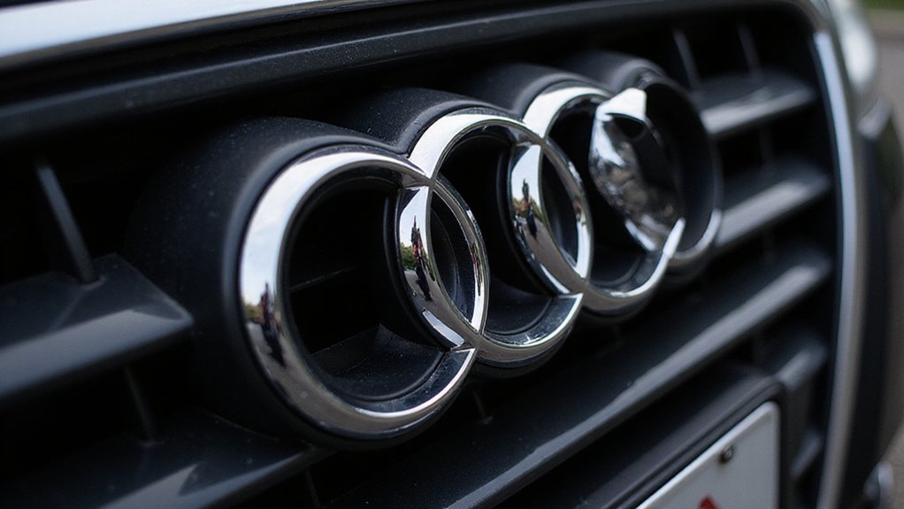
When most people see those four interlocking rings on the front of an Audi, they probably don’t think about a 90-year-old corporate merger. They see luxury. German engineering. Maybe a fat monthly payment. But those rings? They’re basically a corporate tattoo from 1932.
Before the rings, Audi rocked an elegant cursive wordmark. Classy stuff. The kind of logo that belonged on fancy stationery, not a car hood. They even had this weird badge with a giant “1” sitting on geometric shapes. Very art deco. Very dead now.
Then came 1932 and the big merger. Four companies—Audi, DKW, Horch, and Wanderer—decided to join forces and become Auto Union AG. Someone had to design a logo for this automotive Voltron. Their solution? Four rings. One for each company. Innovative thinking there.
The rings went through more makeovers than a reality TV star. First they were 2D. Then 3D. Circles became ovals, then squares, then circles again. The 1930s version looked like someone dropped four metal washers and called it art. In the late 1930s, standardized squared 3D overlapping designs were adopted across all Auto Union logos, bringing some consistency to the chaos.
Post-World War II, they simplified everything because, well, rebuilding from rubble doesn’t leave much time for fancy logos. The company’s roots traced back to automotive pioneers in Zwickau, Saxony, where the foundations of German car manufacturing were laid in the 19th century.
The real transformation came in the 1980s. Audi decided to get serious about being Audi, not just one-fourth of Auto Union. They curved the rings, made them rounder, shinier. Paired them with “Vorsprung durch Technik”—because nothing says accessible like a German tongue-twister.
Audi reinvented itself from merger leftover to luxury icon with rounder, shinier rings and incomprehensible German slogans.
By 2009, they went full chrome. Metallic shading, gradients, the works. Corporate bling at its finest.
Then someone in 2016 had an epiphany: maybe less is more. They stripped everything down to four simple black circles. No shine. No wordmark. Just rings.
Today’s logo is minimalism incarnate. It’s everywhere and says nothing except “expensive German car.” The irony? A symbol born from four companies merging now represents just one. Those other three brands? Dead and buried.
But their rings live on, stuck together forever on every Audi grille, a permanent reminder that even in the auto industry, marriage is complicated.


