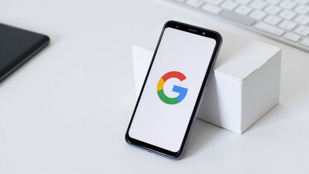
Google’s Iconic ‘G’ Just Got a Secret Rainbow Makeover—Can You Spot It?
In a significant design shift, Google has revealed its first major update to the iconic ‘G’ logo in nearly a decade. The refreshed design, which debuted in May 2025, replaces the sharp, solid color segments with a smooth “rainbow” gradient effect. This marks the first substantial visual change to the logo since its introduction in 2015.
The updated icon features colors that flow into one another—red shifts to yellow, yellow to green, and green to blue—creating a softer, blurred appearance. Design critics have described the new look as “Instagram-esque” due to its trendy gradient style. While the change might seem subtle, it represents a move away from flat, geometric designs toward more dynamic visuals. The new look is significantly different from the previous version that featured a lowercase white ‘g’ on a blue background.
Google’s design evolution embraces fluidity as colors blend seamlessly, trading rigid geometry for Instagram-inspired dynamic aesthetics.
Users first spotted the new logo in the Google Search app for iOS on May 12, 2025. The Android version followed the same day with the Google app 16.18 beta update. However, the gradient ‘G’ hasn’t yet replaced the main Google favicon seen in web browsers, and the classic six-letter Google logo remains unchanged.
The timing of this update is notable, coming just before the annual Google I/O event. This has led to speculation about whether more extensive design overhauls might be announced. Tech observers wonder if other Google products like Gmail, Chrome, and Maps will adopt similar gradient styling in the future. This design language mirrors the aesthetics of Google’s vibrant gradient Gemini AI assistant interface.
Early user reaction has been largely positive, with many finding the new icon more attractive than its predecessor. Some have humorously compared the effect to viewing the original logo without glasses, referencing the intentional blur effect of the gradient.
The rainbow makeover aligns with broader trends in digital branding, which have increasingly embraced gradients and softer color shifts. The new design also shares visual elements with Google’s recent Gemini AI interface, suggesting a cohesive direction for the company’s visual identity moving forward.
Though subtle enough to go unnoticed on smaller screens, the update represents Google’s continuing evolution in the digital design environment.
References
- https://www.dezeen.com/2025/05/13/googles-g-logo-2025/
- https://9to5google.com/2025/05/12/google-icon-update/
- https://www.instagram.com/p/DJkVZDrJLbZ/
- https://samsungmagazine.eu/en/2025/05/12/google-poprve-po-10-letech-aktualizuje-sve-ikonicke-logo-g/
- https://www.creativebloq.com/design/logos-icons/the-new-google-logo-is-already-winning-fans


